The S&P 500 is at risk of rolling over, and while most of the large cap market looks awful to me right now, there is a possibility that if a deep decline does occur, it might do so in waves, with the Nasdaq 100 being the last shoe to drop.
This could be gradual, it could be swift, or it could even be a false alarm, as has been the case so many times the past 16 months, in this era of “buy the dip.” But as a risk manager, I don’t spend a lot of energy trying to speculate or guess what the market WILL do. Instead, I try to gauge how risky different parts of the market are at any point in time, and position accordingly.
I see my most important role to myself and my family as this: first, don’t get burned by life-changing market selloffs. The older I get, the more I wake up every day with that first thought. That doesn’t make me a “perma-bear” but it does make me a “perma-risk manager.” Yes, that’s me.
Or to put it another way, I have always believed it is better to think of investing as a range of possible outcomes, rather than placing a bet on red or black at a roulette table. And also, realizing that sometimes you can cover red and black, only to have green come up. If you are ready for anything, you have a better chance of never being surprised at the worst time.
So my conclusion should not now or ever be interpreted as “this IS going to happen.” That’s great for TV talk and getting attention in trading chat rooms, but not for ongoing, disciplined portfolio management. The latter is a combination of :
1. Managing risk
2. Position sizing
3. What specifically is owned in the portfolio
My single biggest “pet peeve” about the investment dialogue these days is that so much attention is given to the third item on that list, when that is largely worthless with the first two.
Today’s stock market: start with an honest assessment of where we’ve been
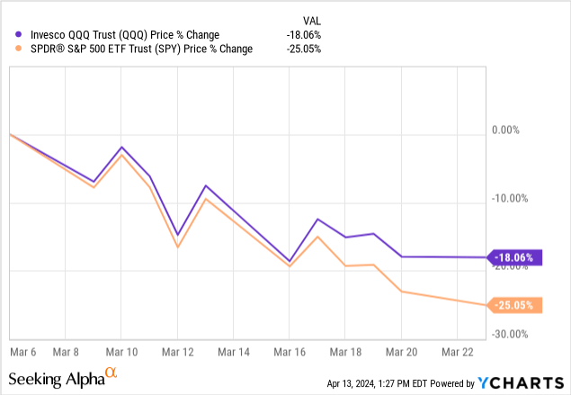
When I look at the US stock market from a technical analysis perspective, since I’ve done that since around 1980, my eyes tend to see things newer technicians might not. And oh is that a double-edged sword! On the one hand, in another publication (before I knew how cool and unique Seeking Alpha was), I wrote an article in March 2020, just as the pandemic was going from concerning to worse than that. The article essentially said that I saw remarkable similarities to the 1987 crash and the 23% single-day drop in the Dow, which at that time was the index everyone followed. The S&P 500 was important, but played second fiddle.
Here’s what happened during the following 2 weeks. SPY fell as it did in 1987, but it took 2 weeks, not 1 day.
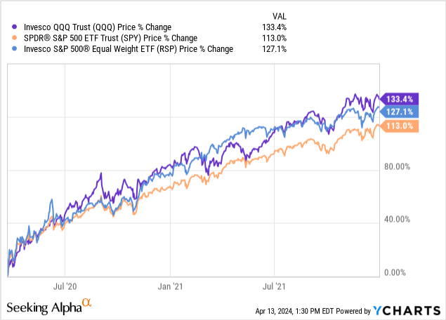
In the end, that didn’t matter because the recovery was fierce, and the rest is history. Because this happened next, from March 23, 2020, through the last trading day of 2021. I’ve added in the equal weight S&P 500 ETF alongside QQQ and SPY, to show that while the mega cap stocks led the market, the advantage was not by that much. Few investors should be upset if they “only” made 113% in 21 months following a pandemic.
As for me, I had one of the worst relative performance periods of my career. For one, I am always “playing offense and defense at the same time,” so my “up market capture” is not typically up there with bolder, more aggressive investors. But I learned a long time ago that keeping score without including all parts of the cycle is just a way that investors try to turn this science and art into a contest, like sports gambling.
No, thanks, I say. My “benchmark” is in sync with what I want out of the money, not what the “market” is doing. The market is an inanimate object. And as they say, we can’t eat relative returns. In other words, if SPY dropped 30% over 3 years, and I’m “only” down 15%, I can’t go to the grocery store and say, “but I outperformed the market, charge me less!”
What’s the return of SPY and QQQ since the start of 2022? Less than most think.
To complete this “trilogy” of charts that lead me to my concerns with what is happening in the broad market, here’s how those 3 market segments have done since the end of 2021. Keep in mind, this is now a 27 1/2-month period. I did not include dividends, but that adds just a little these days, and I wanted to focus on what most investors do, which is the price and price performance of these low-yield major market indicators.
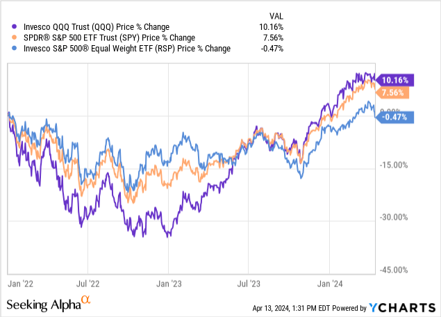
If you are surprised to see that in well over 2 years, QQQ is up only 10%, and SPY up less than 8%, I am very glad I wrote this article. I am not surprised because this type of thing is in my face (on my screen) every day. Because myth-busting is what I hope I am offering to this community, in an era where investing myths run rampant. Like the one that says “the market is doing so well.” If we are looking at only the past year and 3 1/2 months, sure. But that assumes that 2022 had no impact. How soon we forget the 33% drop in QQQ and the 18% drop in SPY that year, set investors back quite a bit.
So between a hellish 5 weeks in 2020 and a rough year in 2022, we can’t blame investors from conveniently forgetting that markets also go down. And when they do, it delays the progress of the true believers in “long-term investing” because making up for that lost money is compounded by making up for all of that lost time.
So, here we are again, at what I think might be a critical point for the US stock market. It is all in the charts to me, and the story the market is telling right now is this: watch out below. But that is not the same as “I’m predicting the market will crash, or even fall.” Because, as a famous market strategist once said.
Predictions are for show, but my asset allocation is for dough
It is a matter of risk management versus crystal balls. I practice the first one, and don’t get drawn into the second one. So now, here’s what I see, why it concerns me, and what I’m doing about it with my own portfolio. Note that I am a nearly 60-year-old semi-retired married fellow, whose kids are essentially off the payroll (thankfully!). So this is my plan, not anyone else’s. I just hope others can take what I say here and in many other articles I write on Seeking Alpha, and personalize it to their own needs, preferences and biases.
What I see
Here’s the S&P 500 as of Friday’s close. I do not mind saying that this is one of the ugliest looks I have seen for this index in a very long time. I have marked 2 levels as what some call “downside targets” but to me, they are just familiar areas where the S&P 500 has been before and topped out, at least briefly. standard technical analysis believes that markets have a memory for which prices they’ve travelled to.
TC2000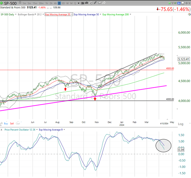
As far as I’m concerned, today it the algorithms from big money hedge funds and trading desks that have the memory, which makes these spots at least temporarily important. I am less concerned with picking spots, and more focused on the fact that, according to the PPO indicator I have at the bottom of all of my charts, the upward momentum of the S&P 500 has been broken for now, and it is close to crossing from “weaker but positive” to negative, standing currently just above the zero mark.
Look back no further than last September, when that indicator broke below zero. That was just a quick downward move of barely 10%, and maybe that’s the worst-case outcome here. I don’t spend many brain cells on that. I am just letting the market tell me its story. And the story right now is NOT that the market WILL decline sharply, but that the chances of that happening are higher than they have been since last September. Sometimes it works out and equity investors are spared from big losses. Other times, it is the first shoe to drop, in a closet full of shoes.
Why it concerns me
I not only see that truly gross PPO circled at the bottom of the chart, I also see that the S&P 500 has broken a steep, upward moving price trend, the twin lines that looked like they could go to the sky, but are now broken to the downside.
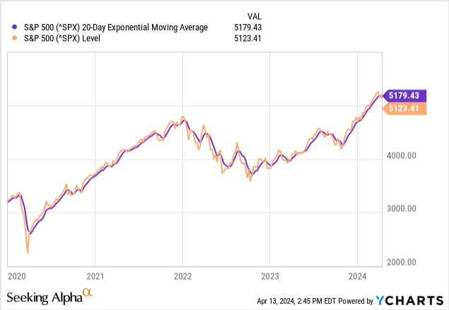
And, the 20-day moving average (red line in top portion of chart) starting to go negative. Why is the 20-day moving average important to me? Because it is a great “tell” for when risk is high, and it is simple to see and use. It isn’t perfect, but as the old commercial says, I don’t leave home without it. Here it is against the S&P 500 price.
And here is the same picture, but with the price and 20-day EMA separated.
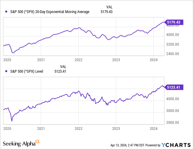
So, this daily view is checking all of the key boxes that make me conclude that risk is very high.
Finally, here’s a weekly price chart, which is where I typically find the market’s “story telling” really plays out, though it naturally takes longer to develop. But it does help avoid the whipsaw we see in daily charts. Just think about the past week: Wednesday drop, Thursday rally, Friday drop. But the week was a downer net-net, and the rest ends up just being trader talk.
The 20-week moving average is still OK, and would not break down until after the daily. That’s why (not shown) I also use charts of 3-day prices, to get an idea if the daily trouble will “bleed into” the weekly. Here, the key takeaways are that the weekly uptrend is broken, just like I showed on the daily. It should be pretty logical to investors that when a sharp rally like the one we saw, about 30% since last October, breaks that uptrend, something’s up… or shall I say, down?
The PPO (lower part of chart) is threatening to roll over like the daily did so clearly, but again it is not there yet. This is why I don’t just sit here and say, “the market’s going down.” I can say it this way: the next 10% move in the S&P 500 is more likely down than up, and at this point I’d call it about a 75% chance of that happening. That’s the difference between market timing and risk management, and between position sizing and speculating. I want to have my cake and eat it too.
TC2000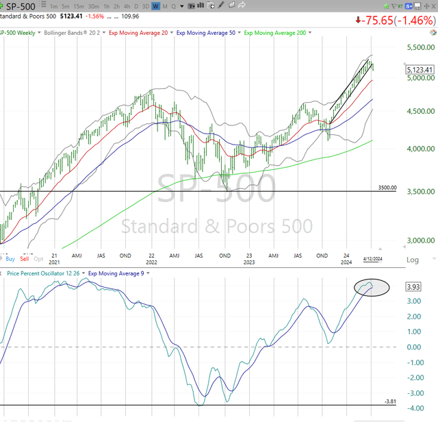
What I’m doing about it
And that is why I created something called the ROAR Score, which I’ve discussed in the past and will write about again in the future. Reward Opportunity and Risk (ROAR) is the tradeoff that means everything to me as an investor, whether it is at the broad market level (for asset allocation) or at the holding-specific level (how much of a stock or ETF to own, how much to use options to hedge, etc.).
I continue to be T-bill heavy. How can I not love this picture below? A year ago, I would not have expected to still be able to lock in those 5%+ yields for another 6-12 months. This is a great anchor to a portfolio for me, as it has been for nearly 2 years.
USTreasuryyieldcurve.com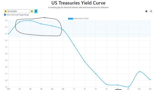
I am filling out a stock portfolio, which will be the focus of an article this week. But that portfolio is only about halfway full in terms of number of stocks (19 out of 40 I’ll get to when it is filled) and most of the existing positions are closer to 2% weightings than the maximum 5% at cost I limit myself to on any stock. And, the portfolio uses options to hedge, and I have about a 40% “notional hedge” on the portfolio using puts. But I also have a modest call option position, which allows me to make some money if this big market threat I see ends up being a total false alarm. Again, I believe in playing offense and defense at the same time.
I’ll outline that, and my broader portfolio alongside that core stock account in a separate article, as this one is about the current concerns I have about equities in general.
The last point for now, as we see this week and the following weeks play out: QQQ looks better than SPY, and that tells me that we could be heading for another round of “the stock market is falling, but the safe haven stocks are the big Nasdaq names.” This is what happened in early 2020, and a few times since then. But I am not going to get ahead of myself.
Each day and week brings more “evidence” to analyze. And right now, keeping a close eye on whether the concerns cited above are false flags or a true trend change that lasts, is top of mind for me.
Read the full article here
